The Problem
UT needs a purpose-built app to administer daily surveys, collect local COVID data, and help perform contact tracing for all students and faculty at the University in a way that is both effective but still respects the users’ level of comfort with regards to digital privacy.
Currently the app has had an early interface put together by the design team, but it has not been evaluated with regards to usability, trust, and likelihood to be used daily. Our team’s objective is to perform this evaluation and deliver a report with our findings and recommendations.
Timeline
This project in its entirety was completed over a four month period, starting just shortly after the first set of prototype screenshots had been completed by UT's design team.
Initial Analysis
Heuristic Analysis
We ran a page-by-page analysis of the initial app design with NNG’s heuristic model to verify that certain components were consistent with usability best practices and identify any problem areas that needed more work.
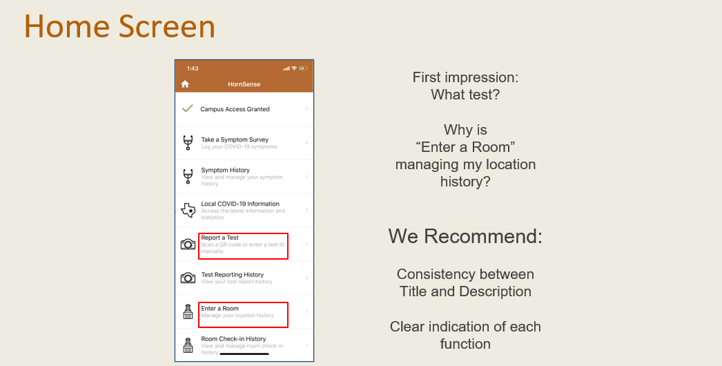
A slide excerpt from the heuristic analysis presentation
Competitive Analysis
We analyzed direct and indirect competitor apps for similar features, strengths, and weaknesses to understand where Protect Texas Together stood in the market. Using this information, we identified some features that may need to be added to be competitive with other universities’ apps, as well as understanding what the app did best.
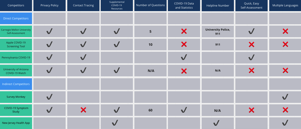
Competitive analysis grid, comparing different competitors and notable features
Post-Redesign Generative Testing and Analysis
Our recommendations from our initial analysis were given to the design team, and a second more hi-fi design was given to us to evaluate.
Recruiting Testing Participants
We constructed a survey to focus on recruiting people representative of our user base to be given to recruiting personnel with little background of the project. The focus would be students, but we also wanted to test with teaching staff, researchers, and other faculty to ensure that the app was effective for all personas.
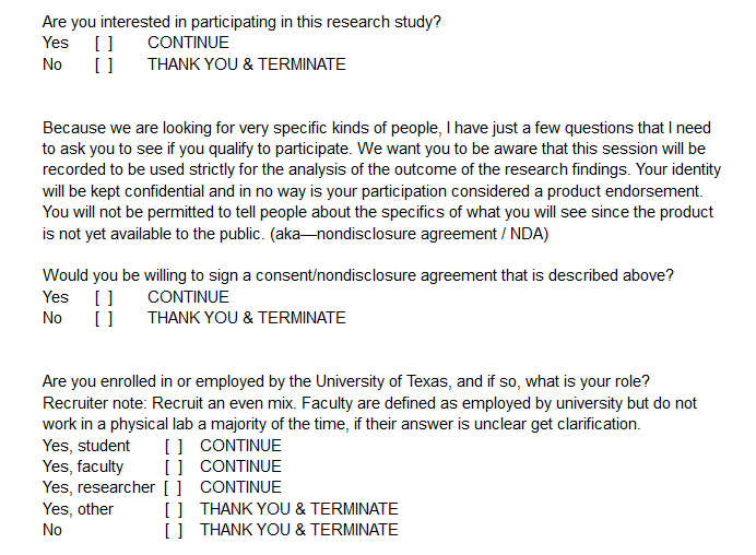
Excerpt from our recruiter survey script
Constructing the Prototype
The prototype was constructed from a number of screenshots given to us by the design team. In all, we assembled six tasks for users to work through that would cover most common and complex use cases in the app. They are assembled in Figma, and some placeholder text was added in order to create as close to a realistic experience as possible for the users.
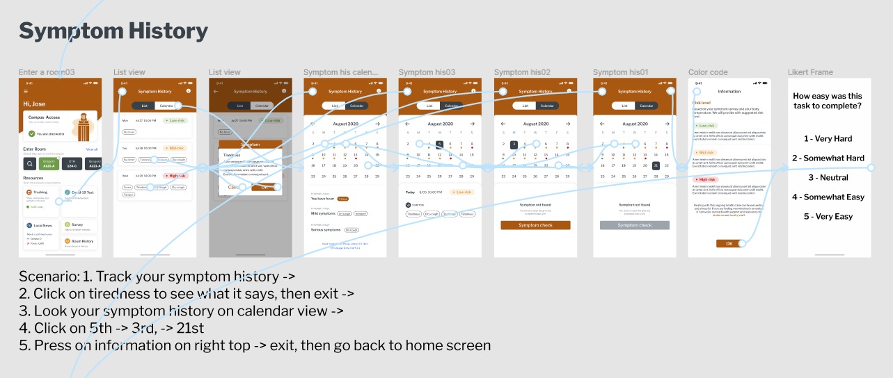
An example task in Figma
Interviews and Generative Testing
The interviews were conducted one-on-one over Zoom, starting with a brief questionnaire and then leading into a series of tasks where users were placed in front of a segment of the prototype and given a scenario. These scenarios varied depending on what part of the app we were testing, but were kept grounded and we left as little guiding information out of the scenario as possible.
Interview Data
The data we collected from the interviews was stored as paraphrased or direct quotes as well as notes about user behaviors, timing, and other nonverbal cues. We conducted six interviews, but in a study not limited by academic constraints this would be expanded to ten or fifteen. After every interview was conducted, we went back over the notes and created a code book to make it easier to search through the documents and see trends across the data.
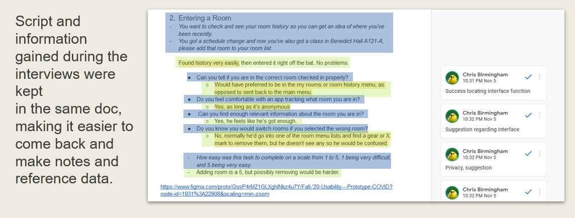
Example of a test question after an interview has been conducted
Data Analysis and Recommendations
We used a WAAD along with our coded notes and likert survey data to examine trends and see where popular or difficult issues arose during the tests. These were then synthesized and converted into concrete, actionable recommendations both relative to various tasks and how they scored based on the difficulty survey as well as solutions that could be applied to the app in general, like cutting down on lengthy descriptions of app functions.
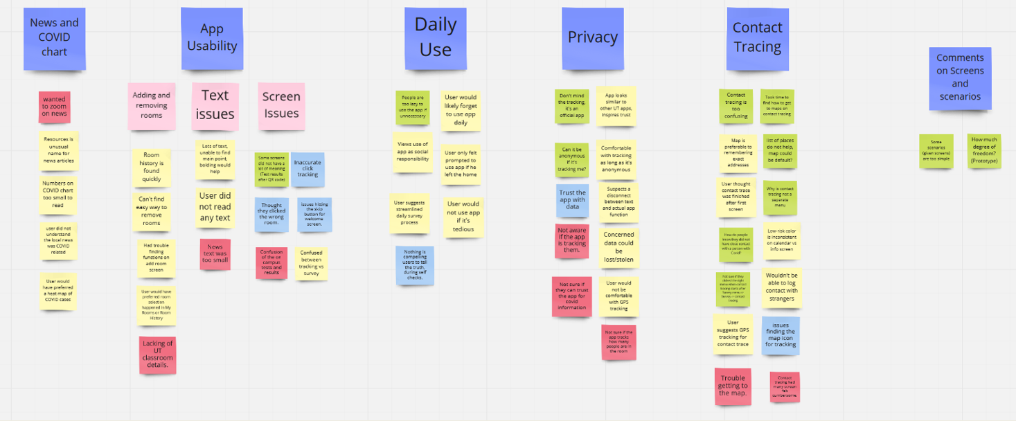
Affinity diagram in Miro
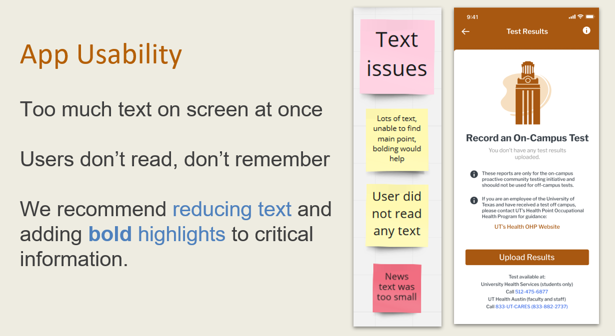
Recommendation as it was given during our presentation