The Problem
Mouser's internal design component wiki is being retooled to be a public-facing repository for accessibility information, as well as being expanded to include information that the developers will use to help standardize components on the site and increase the accessibility rating of the entire site.
Contexual Inquiry and Analysis
Interviews
DevelopersInitial ideation and environmental interviews were done with the team responsible for the accessibility (a11y) rework on the site, as they were the ones most well versed in a11y techniques and, more importantly, the ones currently in the process of learning about a11y.
DesignersWe also spoke with designers as they made up the other half of the expected userbase for the wiki, and would be the ones eventually responsible for putting together the final product.
Data Collection
Answers and comments from the interviews are written as either direct or paraphrased quotes. After the interviews, these notes are synthesized into WANs.
A common problem we found was our developers using outside sites for accessibility information. We identified this as a core cause of our problem, and added questions to our script to zero in on what our wiki was lacking in comparison to these other sites.
WAAD Diagram
Once all the interviews are completed, WANs and other notes are compiled into short notes and arranged in an affinity diagram to examine popular complaints, comments, tools, and other threads.
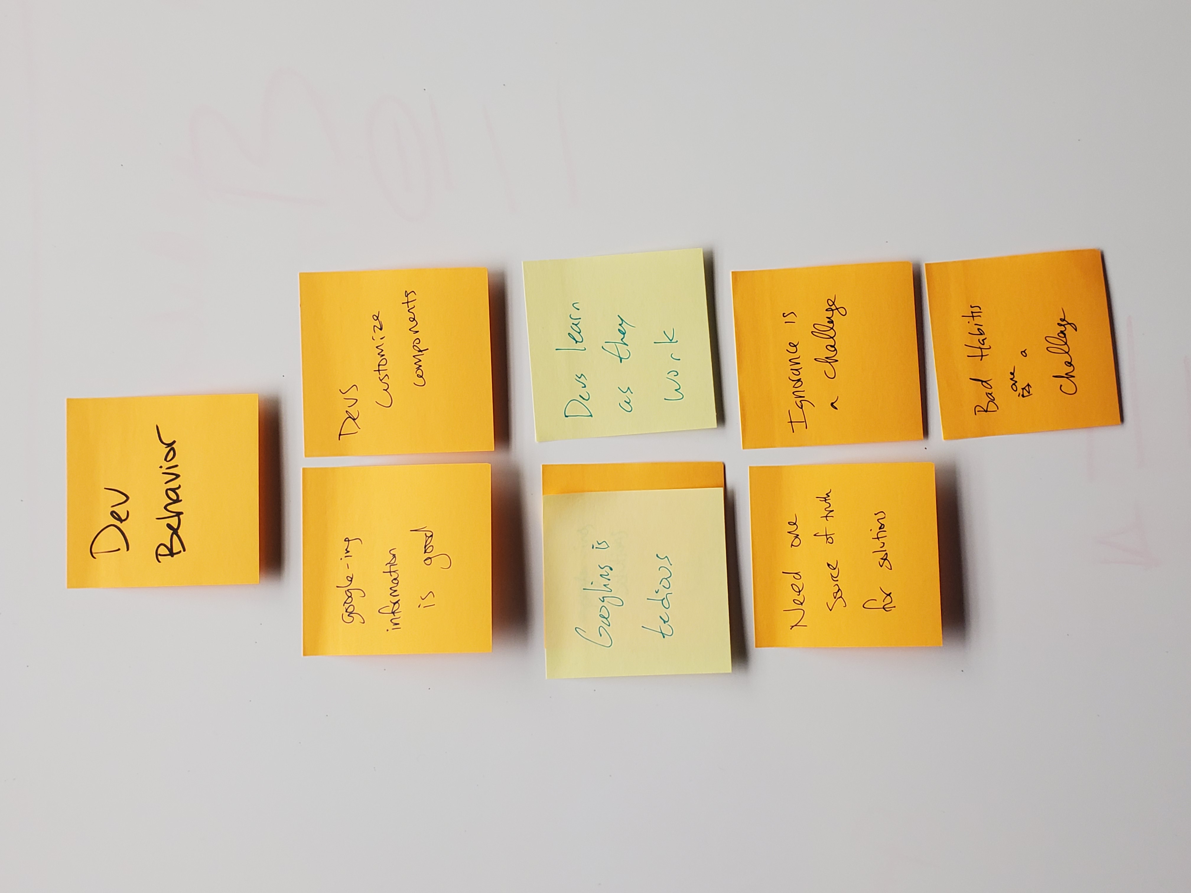
Excerpt of WAAD Diagram
Developing Requirements and Guidelines
Once the WAAD Diagram was complete, through further synthesis a few salient points were reached that would form the backbone of the new wiki interface.
For developers
- Speed
- Accessed mainly “in the moment”
- There are many answers, they need one to stick to
- Specificity is important
Developers are busy. Paths to information need to be obvious and easy to access, with developer specific information being as up front as possible.
From the interivews we found that developers are not coming to the wiki to brush up on theory or do research, they come here when they’re in the middle of implementing a new component and need information on a standard or specific best practice. Wiki needs to focus on hard facts and practical info first.
Our developers were mostly going to Google for information, where they found a lot of good answers regarding implementing accessible components, but these answers differed. We need a wiki that can give one good answer, for convenience and consistency across developers.
We do not have the time to have developers confer and agree on implementations for every single component they need to fix, so we need to give wiki articles that help eliminate ambiguity and give clear guidance.
For designers
- Needs are similar to developers
- Listing by component is good, by subject is unhelpful
- Testing for a11y is new, and hard
Generally designers see the value in having clear, specific answers to questions. While they generally don’t work under the same pace that devs do, they access the wiki as a “just-in-time” source as well, and having access to how the developers implement their components can help them design better ones.
Both designers and developers work on a per-component basis. The original wiki had an extensive section that worked on a per subject basis, and while that is handy for tutorials, for the previous point it can force users to have to sift through info to get their answers, and that is where we’re likely to lose them as they turn to Google for more concrete info.
Another comment from all parties was that everyone on these teams had never had to use a screen reader, magnifier, or tab navigation to use a website. Thus, these teams needed to learn how to use a whole suite of new tools to verify that what we were building was going to be up to spec. We needed some new information on the wiki that could give our team members the info they needed to be successful verifying that we were up to spec.
From management
- Public communication
This wiki needs to be able to be made public facing so it can communicate that we have dedicated teams working on making Mouser.com more accessible.
Prototyping and Testing
Paper Prototypes
Once we put together a list of requirements we set to work seeing what needed to change from the initial design. We made several paper prototypes, and once we settled on a design we set to work on some hi-fi Axure prototypes that we could use to test with.
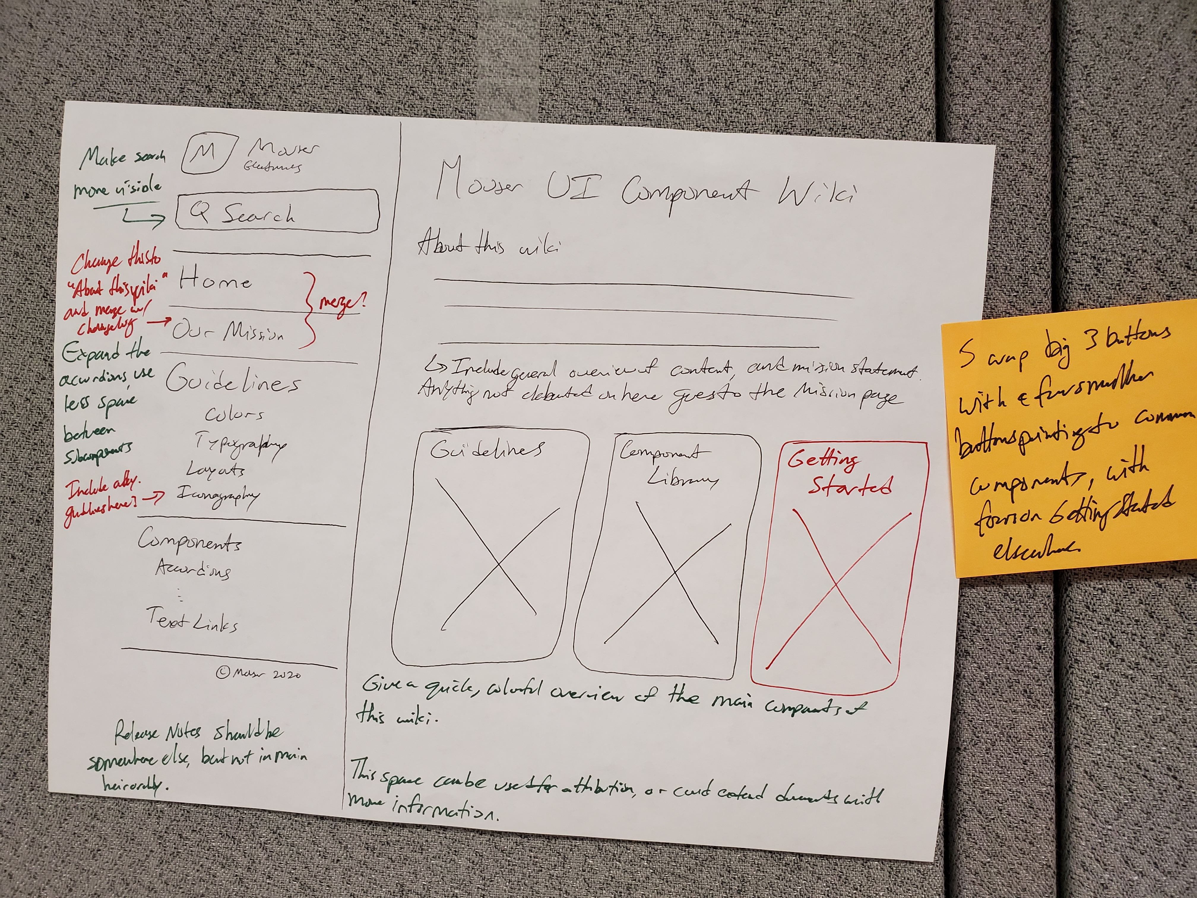
Initial Paper Prototype Landing, With Revision Notes
Redistributing a11y Info
An important part of this redesign is bringing the a11y information that was originally separate in the wiki in line with the rest of the components, making the pages as rich as possible without information bloat.
Axure Prototypes
In Axure, we combined screenshots of the current wiki with new interactive components. Axure allowed us to complete these wireframes quickly, add clickable interactions, and wire them up realistically for testing with developers.
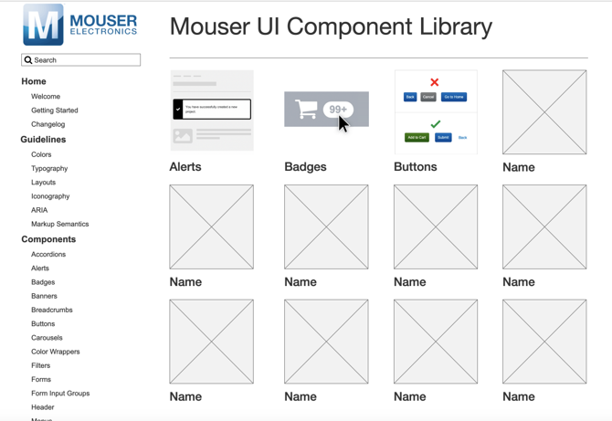
Hi-fi prototype landing page
A/B Testing
For each test, we created an A interface and B interface, and randomized which ones were shown first to eliminate bias. Participants were given a task to navigate to a portion of our wiki. Interviews happened in Zoom and Microsoft Teams with screen share on so we could observe user behavior. Everything was logged, and the users were given a short questionnaire after the test to find any pain points as well as anything they found particularly refreshing.
Testing Results
Several rounds of A/B testing were conducted. After each round, the notes were synthesized into new requirements and adjustments, a new mockup was created, and the A/B test was repeated until we stopped getting any new information, and satisfaction scores improved.
Final Wireframes
After the final round, the last adjustments were made. Here are a few screenshots of the final product as imagined in Axure.
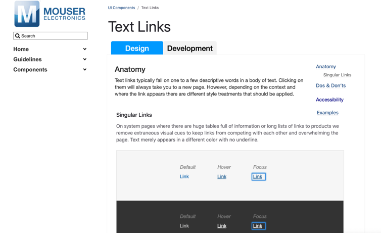
Final version of a content page
Handoff
At the end of the testing period and the internship, I put together a handoff document detailing the requirements. I spoke with leadership and the people who were likely to be in charge of implementation and did some preliminary searches for static site generators to host our new wiki, as well as any useful tools to get a product up with the least amount of hassle.
These findings and the findings from the testing were collected into a document and passed on to the implementation team.
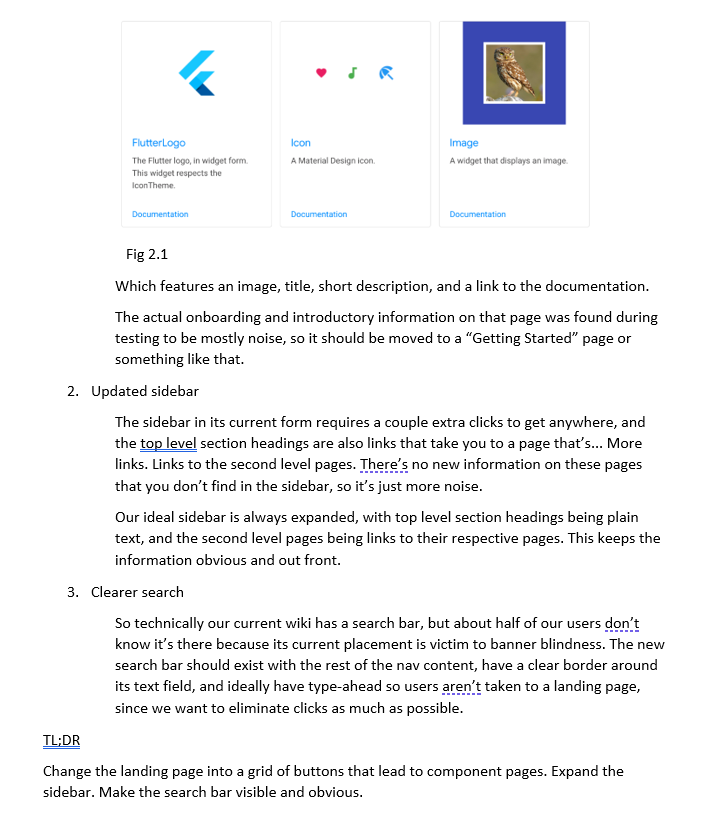
Excerpt from the final handoff report